Interactive data visuals
Featured visual
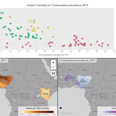
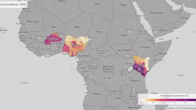
Family Planning
Explore local trends in family planning indicators in Burkina Faso, Kenya, and Nigeria from 2000 to 2020.
Resources
IHME’s Guide to Global Burden of Disease (GBD) web-based tools
Our guide covers tools that are essential for analyzing GBD estimates and data sources. It also includes definitions for the measures and other dimensions of the data, value lists for each dimension, and more.
While our web-based tools can help with analysis, our data catalog, known as the Global Health Data Exchange (GHDx), stores the source information for our research and datasets to download.
IHME staff share their experiences building interactive data visualizations for a global audience.
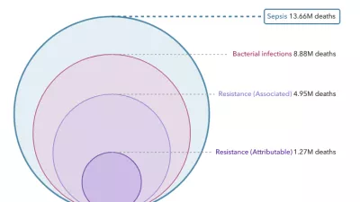
MICROBE key finding
Antimicrobial resistance is now a leading cause of death worldwide
Globally, between 1.27 million and 4.95 million people died because of bacterial antimicrobial resistance, more than HIV/AIDS or malaria.